13 years ago Satoshi Nakamoto unveiled Bitcoin icon; See how BTC logo evolved

As the cryptocurrency industry marks 13 years since the mysterious Bitcoin (BTC) founder Satoshi Nakamoto unveiled the historic “₿” icon and sign, it is time to go down memory lane and look at how many times the iconic Bitcoin logo changed before it received the final form that is widely known and loved today.
Indeed, Satoshi Nakamoto revealed his idea for the redesigned Bitcoin logo, which was to meant to replace its older iteration, showcasing the future images he created in various sizes in a post published on the Bitcointalk forum on February 24, 2010, exactly 13 years to this date.

Plain beginnings
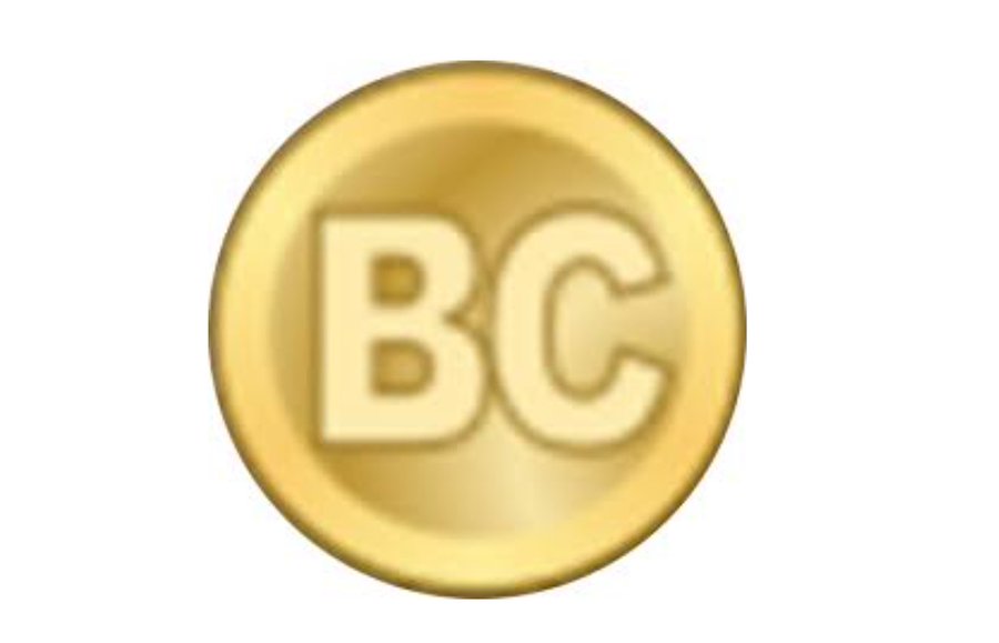
As shown by the Daily Crypto, the redesigned logo was the replacement for the earlier one, released in early 2009, which was also represented in the form of a gold-colored circle but instead of the elaborate “₿” symbol displayed the very plain letters ‘B’ and ‘C’ at its center.

New logo, more details
On February 24, 2010, the Bitcoin symbol became today’s letter ‘B’ with two vertical strokes, following the suggestion loosely based on the Thai baht currency symbol (฿) in the discussion about the maiden cryptocurrency’s future symbol at the Bitcointalk forum. The golden circle itself received some more details.

Final design
In November 2010, Bitcoin received its final form that is recognized around the world – the “₿” symbol, rendered in white and tilted clockwise by 14% inside an orange circle. It was suggested by the Bitcointalk user named Bitboy, who took the symbol created by Satoshi and redesigned it using Visa (NYSE: V) and Mastercard (NYSE: MA) as inspiration.

Design flaws
Interestingly, social media users have recently drawn attention to a couple of minor imperfections in the widely accepted design of the Bitcoin icon, which have been present for over 12 years, although invisible to the naked eye.
A small design detail that has stayed with many iterations of the original #bitcoin logo since its inception in 2010 pic.twitter.com/nYElwD2S6v
— ben (@_Bosch_) February 9, 2023
As it happens, upon zooming in on the original vector files posted by BitBoy, the image reveals a small orange line from the background seeping into the white ₿ symbol, as well as one of the curvatures of the symbol itself not being perfectly smooth, as Twitter users ben and Skyler pointed out.
That said, the necessity for creating new vectors that would fix these flaws could be argued, as the revelation itself doesn’t impact in any way the operations of the flagship decentralized finance (DeFi) asset, unless the crypto community shows interest in resolving the microscopic design issue.


 Bitcoin
  Ethereum
  Tether
  USDC
USDC  TRON
TRON  Dogecoin
  Cardano
  Bitcoin Cash
  Chainlink
  Zcash
Zcash  LEO Token
  Monero
  Stellar
  Litecoin
  Hedera
  Dai
Dai  Cronos
  Tether Gold
  OKB
OKB  Ethereum Classic
  KuCoin
  Gate
Gate  Algorand
  Cosmos Hub
  VeChain
  Tezos
Tezos  Dash
Dash  TrueUSD
  Stacks
  IOTA
IOTA  Basic Attention
  Decred
  Theta Network
  NEO
NEO  Synthetix
  0x Protocol
  Qtum
Qtum  Ravencoin
  DigiByte
  Zilliqa
  Nano
Nano  Holo
Holo  Siacoin
  Numeraire
  Waves
Waves  Ontology
  Status
  BUSD
BUSD  Enjin Coin
  Hive
Hive  Pax Dollar
  Lisk
Lisk  Steem
Steem  Huobi
Huobi  OMG Network
  NEM
NEM  Bitcoin Gold
  Augur
Augur